Arrival
A calm entry point explains what the companion is for and offers two clear starts.
This is an enlarged crop of the original board, not a separate live screen.UX / SERVICE DESIGN / MOBILE / 2026
Independent UX conceptSix connected screens turn the stay, dining and destination into one clear guest journey.
The task is not to fit every hotel service into a phone. It is to reveal the right layer at the right moment — and keep human hospitality close when a screen is not enough.
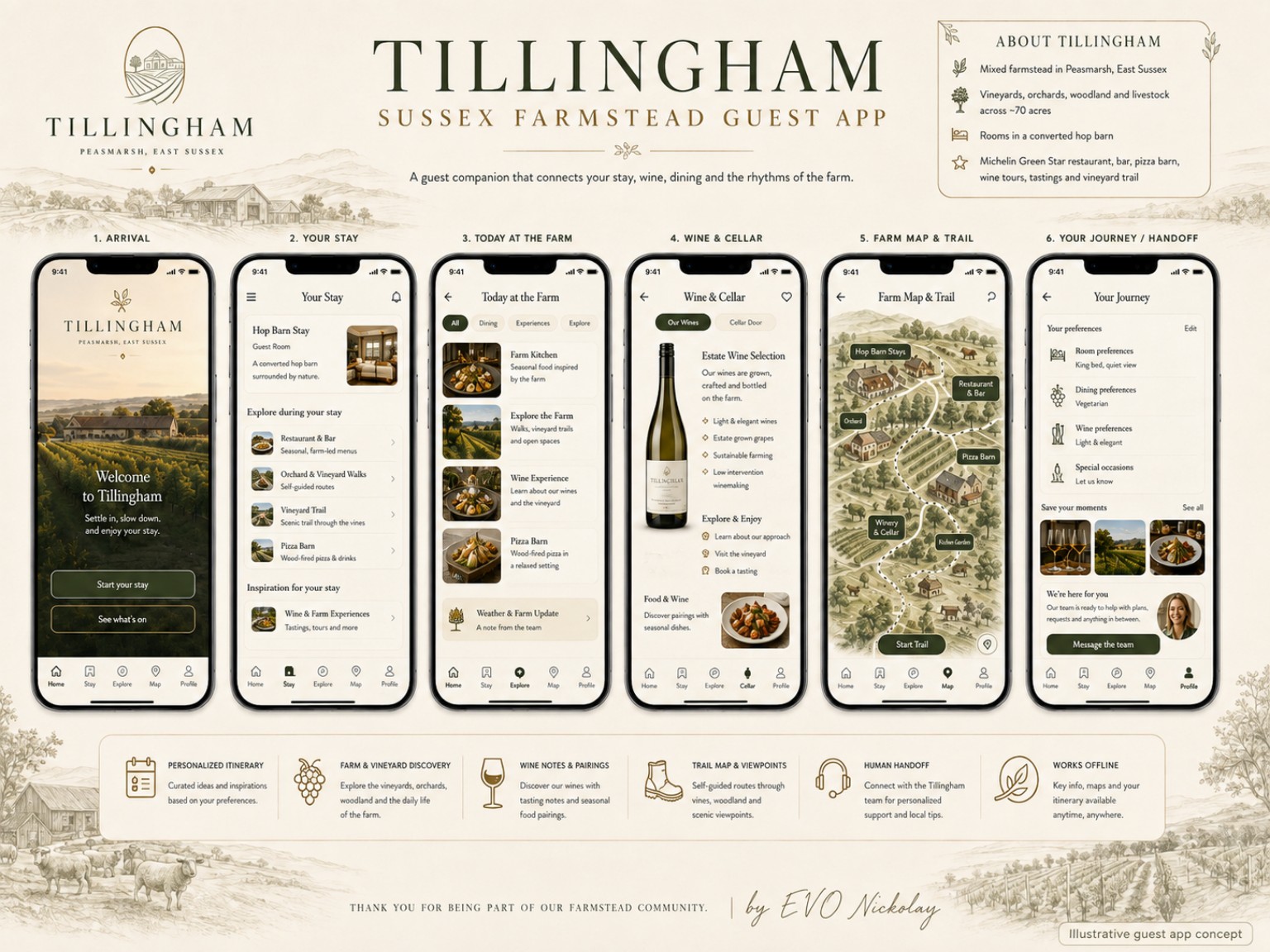
A calm entry point explains what the companion is for and offers two clear starts.
This is an enlarged crop of the original board, not a separate live screen.Arrival explains the companion; Your Stay gathers the essentials around the room and visit.
Today and Wine & Cellar connect a current interest with an activity inside the concept.
The map supports orientation; Journey keeps preferences and a route to a human close.
The process begins with the guest’s moment and need. Content is then distributed across six screens and connected through one navigation model. Essential information stays quick to reach, while contextual questions can move to the team.
Arrival, stay, discovery and help
Content organized by task, not department
Six screens with one logic and navigation
Flows, states, offline access and handoff
This is a design workflow, not a production architecture or proof of implementation.
Product hypothesis, guest journey, information architecture and UX direction.
Guest flow, navigation structure and six detailed mobile mockups.
Guest apps, resort services and digital guides to a destination.
Have a similar guest journey to design?
DISCUSS A TASK →